Designer's Comments
Look carefully for specific instructions
- you should have an intermediate to advanced understanding of HTML to use this layout.
- you may not alter anything other than described below without first contacting me.
- do not change or remove the footer.
customizing
1. replace all XXXXXX with your friendID.
NOTE: the extra tables in the layout will not show up in your myspace profile. it's just a CB error.
Using This Layout
For specific instructions read designer's comments
- This is a div overlay layout, html knowledge required!
- 1. Log into myspace.com
- 2. Click on Edit Profile (Profile 1.0)
- 3. Copy (ctrl c) and paste (ctrl v) code to the specified fields
Layout Comments
Showing latest 9 of 9 comments

suicidaltragedy - please read the notes before mentioning problems. if you put the layout on your myspace, it's perfectly fine (though the navigation might be a little off because i haven't updated layouts on CB that i made before the new navigation--updated ones are at www.fixtatik.com/resources/mys pace/layouts)
O:!!!
I see some of the myspaces crap in the back T.T
This stuff:::
Heroes
Groups: CreateBlog.com
View All CreateBlog.com's Groups
CreateBlog.com's Details
Status: Single
Here for: Networking, Friends
Zodiac Sign: Cancer
CreateBlog .com is in your extended network
CreateBlog.com's Latest Blog Entry [Subscribe to this Blog]
I

beautifully done. hah yeah i kinda agree with russman. but it still looks great. . and i'm more of a girly girly person when it comes to designing layouts.

Great job =)

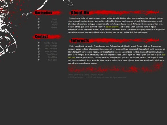
red is my fav. color. plus it goes well with black.
i love it.
im using

yeah, red and black would have looked better. but i like this anyways. great job.

love it all. =]
I like this one too, but The red looks better on black in my opinion. But still pretty good. I favorited it.

The red against the grey is a little bright, but I like the set up and everything. :)
Layout Details
| Designer |
fixtatik
|
| Submitted on | May 20, 2008 |
| Page views | 17,859 |
| Favorites | 77 |
| Comments | 9 |
| Reviewer |
Relentless
|
| Approved on | May 20, 2008 |