Earth Day (comments)
Displaying 1 - 20 of 20 comments

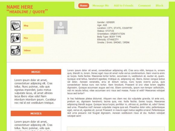
You should eventually make a red & black version of this with some gold trimming, and make the picture more integrated, so users don't have to change the size of it to make it look better. Because in the screenshot, the picture is too small, and it's just hard to get the exact size, unless you make it as a forum, like you do with some of the friends images, in some of your layouts.
i dont really know how this is "earth day" ? idk. and it looks like HIGHLIGHTERS GONE WILD. xP
Blaqheartedstar - i put a note in the "designer's comments." anything that looks wrong in the live preview is a CB error, not on my part. i've coded it so it looks perfectly fine on myspace profiles in IE, firefox, safari & opera. (.userProfileURL { display:none; } is already in the style sheet.

its cute, like the style but the myspace url box shows.
just add this into the code to hide it
.userProfileURL{display:no ne;}

for some reason this reminds me of nickolodeon :) maybe its the colors...

absinthe - it's a 900px width, so it should only be chopped off if you're using 800x600 resolution (total old school xD). then again, if you're using that resolution it should have the same problem in every browser.

For me (on IE) it's a bit off. Parts of the far left side are hidden. Maybe it's just my computer screen size. I don't know.
It's really nice, btw. :D


Very nice work. I love the lime green and the orange rust together.

Whoops, just read your note. Nvm about the extra box.
Sorry, haha. xD
That's really cool.
I love the idea, though I'm not so fond of the colors.
I'd still use it though, cuz its really neat. =]
Only problem is there's an extra box to the right of the main content one on my screen.
i puy the lyout on myspace but my top friends phots havent shown up
what do i do?


Add Comment
You must be logged in to comment
Layout Details
| Designer |
fixtatik
|
| Submitted on | May 14, 2008 |
| Page views | 21720 |
| Favorites | 151 |
| Comments | 20 |
| Reviewer |
Synesthesia
|
| Approved on | May 14, 2008 |