Designer's Comments
Look carefully for specific instructions
- you should have an intermediate to advanced understanding of HTML to use this layout.
- you may not alter anything other than described below without first contacting me.
- do not change or remove the footer.
customizing
1. replace all XXXXXX with your friendID.
2. replace all ###### with your top friends' friendIDs.
3. you can add more sections to the side bar by using [font="Courier New"]TitleContent[/font].
4. in the friends section, replace the images with those of your friends.
credits
- based on a template by studio7designs.
NOTE: the extra tables in the layout will not show up in your myspace profile. it's just a CB error.
Using This Layout
For specific instructions read designer's comments
- This is a div overlay layout, html knowledge required!
- 1. Log into myspace.com
- 2. Click on Edit Profile (Profile 1.0)
- 3. Copy (ctrl c) and paste (ctrl v) code to the specified fields
Layout Comments
Showing latest 10 of 20 comments

Nice i think i'm gonna use this I like it
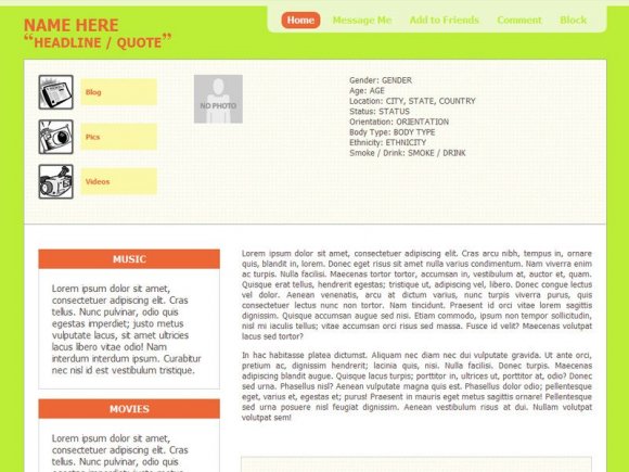
You should eventually make a red & black version of this with some gold trimming, and make the picture more integrated, so users don't have to change the size of it to make it look better. Because in the screenshot, the picture is too small, and it's just hard to get the exact size, unless you make it as a forum, like you do with some of the friends images, in some of your layouts.
i dont really know how this is "earth day" ? idk. and it looks like HIGHLIGHTERS GONE WILD. xP
Blaqheartedstar - i put a note in the "designer's comments." anything that looks wrong in the live preview is a CB error, not on my part. i've coded it so it looks perfectly fine on myspace profiles in IE, firefox, safari & opera. (.userProfileURL { display:none; } is already in the style sheet.

its cute, like the style but the myspace url box shows.
just add this into the code to hide it
.userProfileURL{display:no ne;}

for some reason this reminds me of nickolodeon :) maybe its the colors...

great setup + colors + rollovers!
absinthe - it's a 900px width, so it should only be chopped off if you're using 800x600 resolution (total old school xD). then again, if you're using that resolution it should have the same problem in every browser.

For me (on IE) it's a bit off. Parts of the far left side are hidden. Maybe it's just my computer screen size. I don't know.
It's really nice, btw. :D

this is pretty awesome. i love how bright it is.
Layout Details
| Designer |
fixtatik
|
| Submitted on | May 14, 2008 |
| Page views | 21,739 |
| Favorites | 151 |
| Comments | 20 |
| Reviewer |
Synesthesia
|
| Approved on | May 14, 2008 |