Free (comments)
Displaying 1 - 13 of 13 comments


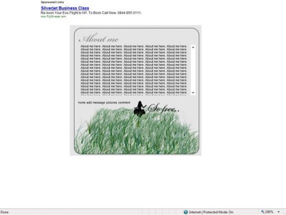
You should make the navigation font a bit bolder, and move it elsewhere. o_o; At first glance, it seems to be part of the picture/"caption".


ran out of ideas for the nav. suggestions wouldn't hurt though.


Well, I never comment on things so feel empowered. I actually love this. It would've been amazing if the lady was running or jumping but it works. Kudos.

i love the simplicity. i think it would look better with a white background, so it could stand out more.

the nav needs some serious work and the rest has already been spoken, i'm not going to repeat it. but anyway, i like how its small and easy to fill in.

I like the simplicity. I understand that the layout is supposed to be on the minimal side, but the navigation didn't have to be so plain.

yeah,
is it supposed to have a white background or gray?
because i'm using firfox and it has a gray background when i preview it.
it's cooool though.
the little person is cuttee.
=D
Interesting. But it don't look right in the preview. Your image there, shows it looking pretty good, but with a white BG, on the preview it has a full grey bg, but something isn't right about it. You'd have to see for yourself, to know what I'm talking about. I'm using Firefox.
Add Comment
You must be logged in to comment