Summer Joy (comments)
Displaying 1 - 14 of 14 comments


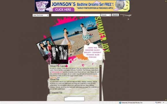
i'm not too sure about that black and white photo. i don't like it that much. but i like the whole concept of this.

This is cute. I agree the images are a little low quality though.

i like it! except the background color... & of course the images could be better quality, other than that it's nice! :)


Don't really like the balck and white photo. It throws it off for me. The rest of the images are also low quality. But the rest is really nice.
Kudos.

That is the content mike put in his layouts to fill up space..and as far as the setup it has some similarities to angeline's layout too. But nonetheless the image is bad quality if it wasn't for that this would have turned out ok :].

Nice, a little blurry, but the content also looks similar to Mike's layouts.

i don't know why..but this is kinda kinda looks similar to angeline's layout to the sky


The images are a little low quality, and I don't like the placement you used.
The paper is neat, though. It's all crinkly! Unique. C:
Add Comment
You must be logged in to comment