Blissful Photos (comments)
Displaying 1 - 15 of 15 comments

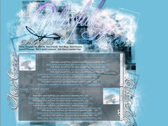
I'm sorry, don't hate me. I just realized you're on my friends list. Ooops. But you need to hear this as an artist. They layout is good but it's the florescent blue that's irritating me...with that gray. But let me move on to the next layout...
You and this florescent blue. Sigh. Florescent blue goes well with baby pink, not black with gray.


i like this alot=) u wanna make me one kindah like this???? get at me thanks


The font is hard to read, and you went a lil overboard with the brushes.
Overall however, great job :D


the brushwork looks a little chaotic, but it's a nice layout all the same.

I think you went a little overboard with the brushes, but the concept is cute. =)

i like the design itself. but it kind of confused me :) good job though

Add Comment
You must be logged in to comment
Layout Details
| Designer |
MiseryLayouts
|
| Submitted on | Apr 27, 2008 |
| Page views | 29511 |
| Favorites | 243 |
| Comments | 15 |
| Reviewer |
micron
|
| Approved on | Apr 27, 2008 |