Chaotic. (comments)
Displaying 1 - 20 of 24 comments

I don't think the picture quality is 'garbage'. Maybe it's not as 'clear' as it could be but whatever. I like the layout, personally.


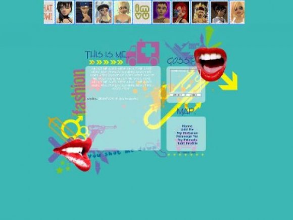
The layout is nice, but the picture quality is garbage.


ohh i see sorry i mixed up the links :) everythings fine now & thanks for all the feedback :) oh and the music player, i kinda wanted it up there =X if you can find the code feel free to remove it lol and....cloudPHLI exactly what are you tlaking about =X

love the layout..im actually using it now...the only think is that the my pictures link and the message links are the same..when ever someone tries to send me a message they get redirected to my pics..can u change the code?

WONDERFUL I LOVE IT.
Everything worked out perrrffeeccttllyy.
There's absolutely nothing wrong with it.
PERFECT.

love it! C:
only thing is my music player is floating somewhere near the top, but the rest is perfect so im not complaining! good job SOLEorgasmic xxx


How do you Edit About Me code with your Friend ID? Love this layout by the way.

oh man, this is pretty cool. especially where the comment box is. i actually kind of like how the colors are used.
Yes, the navigation could be improved. At least change the font face and size, with some simple color-change hovers.
Miss Cuppy Cake; it looks nothing like hers. the only thing similar as Drama said was the ONE mouth. which i didnt know she used.
framed; thanks for your critique, i'll try to put more umph in my next layout.
the rest of you guys; thanks mucho for the great feedback!

The bright red lips look good, but the other pastel colors don't. They look plain in comparison.
I would've done something with the navigation. It's rather blah.

Add Comment
You must be logged in to comment