quiet.touch (comments)
Displaying 1 - 11 of 11 comments


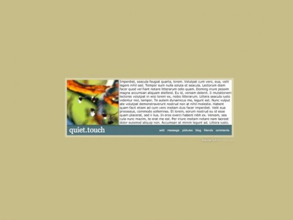
i like the rollovers, but this layout is a little too small and too simple.
isnt it a remaster of another one you have made?
i like it, but would not use it. it would have been better if you had found a picture that fitted well instead of someone finding one to put there.

I wish it was a little bigger, but other than that, I really like it.


I like this a lot. The rollovers are great, and the smaller, wider box is cool too. It's so different from the other layouts.
I agree about the image, though. It would've looked better in focus rather than blurry.

I really, really like this layout's simplicity. Did you purposely use an out-of-focus image, though? I think the layout would look better overall with a higher-quality image.
This is interesting, but still a tad bland. I'd still use it though, if only it had a Block button since you hide the drop down nav that MySpace usually keeps. I just don't wanna risk getting deleted. I dunno why no body wants to keep the Block button. If you didn't wanna hear from a certain person wouldn't you wanna block them too? You bet your ass you would, lol.

I love the simplicity of it. And the colours are nice too. However, the picture on the left doesn't contribute to the rest of it very well. But good job, nonetheless. =]

this is very simple. a good simple. but the brown background is kind of off.

Add Comment
You must be logged in to comment
Layout Details
| Designer |
allvanishing
|
| Submitted on | Apr 18, 2008 |
| Page views | 20400 |
| Favorites | 102 |
| Comments | 11 |
| Reviewer |
miyashu
|
| Approved on | Apr 19, 2008 |