Jealousy Feat. MK (comments)
Displaying 1 - 17 of 17 comments

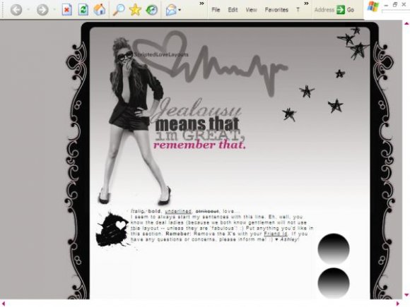
great job! nav fonts could be a lil better...but still good.

i loveee this layoutt..
sadly it wont work for me.. =[


i really dont like the navigation, but the layout really rocks.

I like the colours and font, the banner's cute, but that navigation just doesn't fit- so other than that it's really nice.

Uhmm i like this but its a bit to simple for me, but it looks nice!

The design is really nice, i like it, but not sure if its the code, my screen, my browser or if it was designed like that, but its partially covering up the ad and also the google bar in showing, its also not centered.

lol. i love the quote. it looks like there's a lot going out though, i guess its because of the many different fonts? just like synesthesia said. the nav is kind of odd too but i love the stars and the border around the div.

love the edges but its best to try and keep to only 2 fonts in the header, the nav isent so bad but could of been better. good job in all.

The only thing I dislike is the navigation. but awesome overall. :)

Too many different fonts in the banner, none of which work that well, except the one for "Jealousy." I like the edges of the layout.
Add Comment
You must be logged in to comment
Layout Details
| Designer |
ScriptedLove
|
| Submitted on | Apr 18, 2008 |
| Page views | 37405 |
| Favorites | 275 |
| Comments | 17 |
| Reviewer |
miyashu
|
| Approved on | Apr 18, 2008 |