Wake up darling (comments)
Displaying 21 - 39 of 39 comments

hey um.. i kind of ran in 2 a lil problem with ur nav
when i click on it it opens a new window idk if its soposed 2 do that but i dont want it 2
the layout is hot but thats the only thing that kinda isnt workin 4 me
get back at me
thanxx

dotaquote: ohh, well every time I see the previews or check it, it comes out perfectly fine. Maybe that is it, all it needs its to be re-freshed?
ill take a look at it again. thanks.

I think the layout's great. It's a really neat idea. I haven't put it on my MySpace, but when I did open the live preview the navigation bar was off. But when I refreshed it, it realigned itself perfectly fine. So I figured maybe that was just how it had loaded at first and might have messed up.

Does the nav look anything like the screenshot?
I need a screenshot, i have no idea how it's off. =S
ah.

I really like this! i might use it when i need a new layout!
The nav is a wee bit off though.

sorry i lied, for me in ff the nav is to the right not the left x]

It's alright. thanks. XD but if it does look weird in everyone's browsers, yeah..people should tell me. heh.

oh then i guess its just mine? its cool though, it looks great overall. lol. :]
hm, the nav looks the same on both browsers for me. It doesn't look distorted or anything, right? at least..
geesh, i took forever. lol.

I love your layouts! They're so great, and your images, where'd you come up with these ideas? Nice job with this layout. =D
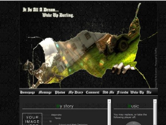
the nav is too far off to the right on ie and the font doesn't really match the layout. but i like how the banner came out, its great. the torn edges are pretty cool too.
I love it. the image, colors, ssetup, all of it i like :] the nav is way to the left in ff, but i think you know that. great job.
i love the font Old English but i never get a chance to use it cause they always say it dosent fit :P
im not great at choosing layout font, if anyone hasn't figure that out. =S
Anyhow, I love old english font for this layout, unfortunately, I couldn't include it in the content cuz it was a little too difficult to read.
Old English reminds me of a faded Victorian dream. It all lies metaphorically speaking. :) It's hard to understand my mind.
The font in the banner doesn't match the layout theme well.
I tried getting rid of the border, but at the end, gave up. =S. lol. So I just made it lighter. the border is actually a 'glow' that was suppose to be traced around the 'ripping'. I tried putting the navigation in the banner itself, couldn't figure it out either. blah.
i love how it came out anyway. :P
thank you for your comments and suggestions, you two. XD

Wow the image looks awesome. But the little border around the edges of it bugs me. And why didn't you just put the navigation into the actual banner image, it would've been aligned. Other than that great job.
this is absolutely the best layout ive ever seen
its what i have been waiting for so long for!!!!!!!!! thank you so much
Add Comment
You must be logged in to comment
Layout Details
| Designer |
alecreations
|
| Submitted on | Apr 18, 2008 |
| Page views | 42609 |
| Favorites | 354 |
| Comments | 39 |
| Reviewer |
miyashu
|
| Approved on | Apr 18, 2008 |