White Tree (comments)
Displaying 21 - 40 of 44 comments

Is there anyway of adding an additional Row onh the right side (not that there's anything wrong with this layout) that you can put all the comment in?

on that comment below, you have to take the space out of the link to get to it.
:)
i love this layout.
i am using it on my photo editing profile:
www.myspace.com/simp lephotoedit
everybody go check it out.
:)
it is being reconstructed with this layout, so you can mainly just look at the pics.
don't worry, my profile is set to public so everyone can view it and my pictures. :)
thanks crotchettheleper!
keep up to good work.


Thank you so much mkdesigns; I tried to fix some of the stuff that was in the FF preview. Does it look any better? Or is it still the same?


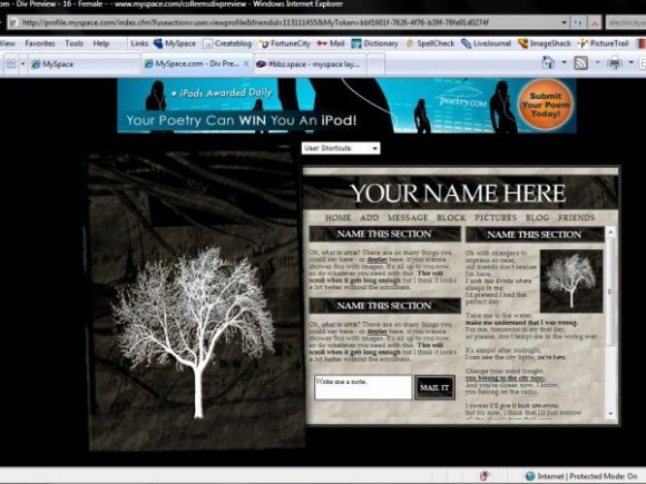
here's the screenshot if your curious: http://img256.imageshack.us/im g256/8228/screenshotnf4.png
if it has spaces in between the link then just backspace empty space in the link :)
Oh no, does it really? :(
The background's still transparent on my computer. Oh well, haha. & Thank you! :D

A TREE! This is really nice! Greate job! I love the arrangement of the sections and whatnot. However, the picture of the tree on the left has a white background, but that's probably from when it was transferred to CB.
Awesome work! =]
Thank you so much everyone. :D
Seeing as I don't have firefox, can anyone send me a screenshot of what it looks like in FF? That would be greatly appreciated, because I would love to fix this. :)
& illusionschange, the lyrics are from the song "Electricityscape" by The Strokes. :D

omg! we totally had the same idea for a layout. I had submitted something similar to this, but it got rejected. :( I like the idea, as everyone else said, FF yeah doesn't look that great. But from the screenshot looks awesome.

what lyrics are in the right hand side?
love the layout

despite not working in ff, this is beautiful in ie. aye...another creative layout i've seen. =)

I love this too but it looks like shit in Firefox.
I needed to use shitty IE to view it. So I won't use it. You should make it work in Firefox and IE.

i like how that white tree stands out in the grunge of everything. awesome job with this layout.


looks great from the preview :] real messed up for me in FF. nice job from what i can see though
Add Comment
You must be logged in to comment
Layout Details
| Designer |
CrotchetTheLeper
|
| Submitted on | Apr 17, 2008 |
| Page views | 43251 |
| Favorites | 364 |
| Comments | 44 |
| Reviewer |
pandora
|
| Approved on | Apr 17, 2008 |