Designer's Comments
Look carefully for specific instructions
I haven't made a DIV for about two months or more. :[
Making these made me feel better. Anyway.
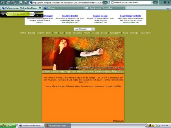
The image is of Gerard Way from My Chemical Romance. The image is from a magazine snippit, it had no name.
Anywho.
I only tested this in FF because I deleted IE from my computer because it's crap. So this is catered toward FF browsers :] It should work in IE though. And I made sure this one is aligned. I used a different style sheet then my last layout which messed up.
-PLEASE READ DIRECTIONS BEFORE ASKING ME QUESTIONS-
A lot of people keep asking me the same basic questions, though I think in my layouts I kept it pretty simple.
Follow these simple directions to use a MarinaGrafix div overlay.
I hope this helps! XD
-------------
1. Open your Profile Editing page.
2. Delete EVERYTHING from EVERY field (about me, heros, interests, etc...)
3. Press save.
4. Copy and paste the layout parts to the correct section. (About me and I'd Like to Meet)
5. DO NOT PRESS SAVE. This will change the xxx's into MSP links!
6. Open a separate tab/window, and go to your myspace profile.
7. Copy your Friend ID digits. It's written in the URL in the address bar.
8. Go to the About Me section with the new layout code.
9. Find the XXXXXX's in the about me section, and replace them with your friend ID (paste them in there.)
10. Press SAVE!
If you have any questions or problems, you can message me
Using This Layout
For specific instructions read designer's comments
- This is a div overlay layout, html knowledge required!
- 1. Log into myspace.com
- 2. Click on Edit Profile (Profile 1.0)
- 3. Copy (ctrl c) and paste (ctrl v) code to the specified fields
Layout Comments
Showing latest 6 of 6 comments

I realllly love this! I'm a huge MCR fan.
Though if it had some more sections for content and maybe a little less orange, I'd definitely use it. :]
Lovely work though!

Great setup. I love its simplicity. I also like the graphic. Nice!

i like the colors together.
:)
great layout.

i don't really like the colors that much. but thats just me, i like the simple setup and the banner though. good job.

this is nice. im not sure about the orange and the green. i don't think they go well together. the banner's good but everything else seems a bit plain. i like the navigation too. simple but cute. anyhow, this is a good layout. keep up the good work.

Ah, I saw this picture in my favourite magazine, called frankie.
I don't really go for the all orange, but it's a good layout anyway
Layout Details
| Designer |
MarinaGrafix
|
| Submitted on | Apr 17, 2008 |
| Page views | 5,658 |
| Favorites | 20 |
| Comments | 6 |
| Reviewer |
Relentless
|
| Approved on | Apr 17, 2008 |