Designer's Comments
Look carefully for specific instructions
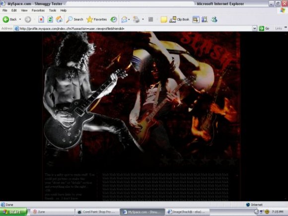
1024x768 Res.
edit all of the "FRIENDID"s
The CB preview shows the nasty myspace tables...i don't know why, but on a real myspace (or at least on mine) it looks fine.
And by the way, the navigation's rather vague. So a heads up, the nav is the stars on the right (they have ALTs to make it a tad easier), below the banner, and the cred links are the stars on the bottom left.
Credits:
PHOTOS
VelvetRevolver.com
Slashsworld.com
BRUSHES/TEXTURES
meth@Deviantart
Botched
Shizoo
Visit Bad Obsession for more of my work! =]
Using This Layout
For specific instructions read designer's comments
- This is a div overlay layout, html knowledge required!
- 1. Log into myspace.com
- 2. Click on Edit Profile (Profile 1.0)
- 3. Copy (ctrl c) and paste (ctrl v) code to the specified fields
Layout Comments
Showing latest 10 of 12 comments

OH MY LANTA!!!!!!!!!!!!!!! I LOVE SLASH AND I LOVE THIS! F**kin A! man.AWESOME!

i like it! its a bit cludered near the top right though.

interesting. >_

I like it but can you fix the Nav bar like put some words to it please Thank you

Appreciate the comments, guys! I brightened up the font color a bit.

you can barely see the content D;
The font color is too hard to read against the background color.

the banner is nice, but i think the darkness is perhaps a little too dark...and hard for peoplet o read.

Nice Slash!, he's one of my two inspirations. But yeah I'd have to agree with everything dinosuaria said.

Can't really read the font. It needs to be a bit lighter and bigger.
I like the blend. It turned out nice. The only thing I would change is the picture quality. It's a bit low. Kind of grainy and pixelated.
Can't see the navigation. I'd brighten it up a bit.
Nicely done. 6.7/10