Imagine (comments)
Displaying 1 - 20 of 27 comments

lol i'm backkk :P idk if it has anything to do with the layout but the music won't play if it's hidden
it won't show where you told us to write i'm so frustrated :((((

i love this layout
i think it's adorable!!!!
the only thing is
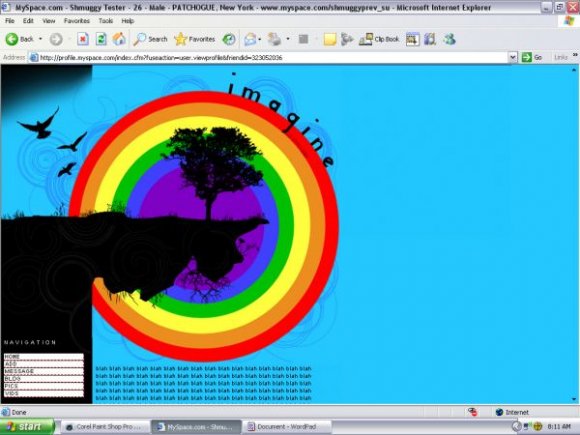
i can't really read the font in the about me
i'm trying to make it bigger
but aparently i'm doing it wrong
can you help me please?? =[
everything else is gorgeous
i LOVE LOVE LOVE the pic
and the comment box is to die for!!
good job =D

help me please i cant use this layout...i inert all the codes and the friend id but it still keep showing me a blue screan on myspace...plesa hlp me
Is there anyway to get the MySpace bottom link off? The whole copyright and date, All Rights Reserved stuff? It is mocking me. Oh, and I think the navigation is great. No problems with that here.


i do like this layout, im not sure about the navigation, but the banner is really quite nice.
just improve the positioning of the nav and colours next time :)

yep, I'm serious. lol.
you totally don't need to edit them. you can even just remove the &mytoken part from the end of the URL.
:)

absinthinjector: i know, when i was making this, i was trying to do it with a table, but it wasn't coming out right, so as a last resort, i just made the nav in images. Next time i have designer's block, i'll try fixing that, because i agree, the image nav is crazy.
falsetigerlimbs: are you serious?! because i can't stand those things! lol

why is there images for the navigation?
it would be much more simple and creative to use css
You know, the mytokens don't have to be edited; they're not even necessary lol. It's just information for myspace about what page you were on before, and maybe something else. Just letting you know, because that might confuse some people.
thanks for the comments, guys! =]
masterkatnip: I don't know why, but on the CB preview the alignment's a little off...on my myspace it looks fine. I don't know what that's about =\

the rainbow looks out of place to me, and i think you could've stuck with darker colors. BUT i think overall, it's a creative piece and you did a great job.

Wow this looks cool/trippy, I just checked out your site too. Pretty Tied up is an amazing song.
Add Comment
You must be logged in to comment
Layout Details
| Designer |
shmuggy
|
| Submitted on | Apr 13, 2008 |
| Page views | 31554 |
| Favorites | 367 |
| Comments | 27 |
| Reviewer |
karmakiller
|
| Approved on | Apr 13, 2008 |