Scenic Default (comments)
Displaying 1 - 20 of 35 comments


OMG
SO DAMN
PRETTY AND
SIMPLE AND
AND NATUREFUL
:DDDDDDD

to who-wants-toast : my god, I'm thick, but thanks so much haha:D I'm using it now :)

Thanks for that. I would, if you wouldn't mind? Thanks so much. :)

Jen172686 -
the classified button is under the home button because of the button padding.
find the CSS tag for a.navbar
then change "padding: 0 9px 0 9px;" to smaller numbers.
when you said the preview, you meant the screenshot, right?
in the screenshot, the aboutme section is labeled "About Me" because i didn't like the "blurbs" title and coded my layout to take the whole thing out. if you want the code, i can give it to you.
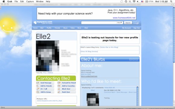
I love this layout, but I was wondering a few things. Is there a way to fix the alignment on the nav bar? The "classifieds" link is below the "home" link. And in this preview, the about me section is white and the blue bar says about me. But in the actual layout, it's blue, and the blue bar says blurbs. Is there a way to change that too? Thanks!


I lovee this!
the only thing that didnt work was the navbar, and i know why, i have an interferring code but it looks great without the navbar too!!
XD
ariachan -
it works on firefox/explorer, as far as i've tested
is that when you actually save the layout to your profile?
sorry about that

OMG i love this layout hecka lots! i was just wondering why, on the navigation, my home button is raised higher than the others? it looks kind of awekard!

Ahoysailors1; It's not div overlay, so you don't need to put your friend I.D. in it :]
okay I probably sound computer illiterate or something but I don't see where to put my friend ID in this layout? Usually there's XXXX or 'friend ID here' but I've looked through this layout loads of tiems and I can't see it! Where is it?

My screen res is 1024x768, but for some reason the top nav is all messed up, and the Blurbs text isn't showing up well at all.... and when I took the code out to hide friends, and comments, they don't show up right either.... I like the concept, but it don't work right for me, so I probably won't use it.


just to let you know, it looks crap in the preview but excellent in the actual myspace layout :) so people dont get put off by the live preview
Add Comment
You must be logged in to comment