Designer's Comments
Look carefully for specific instructions
Updated with new coding. Live preview still DOES NOT work.
NOTE: THE LAYOUT DOESN'T ALIGN CORRECTLY IN THE PREVIEW. NEITHER DO THE IMAGES DISPLAY PROPERLY.
Click here for a preview.
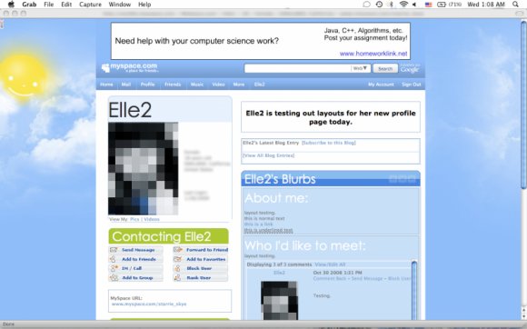
This is based off a Myspace homepage theme.
This layout works in both Firefox and Explorer. It's been tested. It works best in a 1280x1024 resolution, but also works in a 1024x768 resolution.
The layout code hides top friends and puts your comments in a scrollbox. It works best if you have a short display name.
Using This Layout
For specific instructions read designer's comments
- 1. Log into myspace.com
- 2. Click on Edit Profile (Profile 1.0)
- 3. Copy (ctrl c) and paste (ctrl v) code to the specified fields
Layout Comments
Showing latest 10 of 35 comments

I love the Background!

very simple which i like

very cute!

OMG
SO DAMN
PRETTY AND
SIMPLE AND
AND NATUREFUL
:DDDDDDD
i love it ^_^

to who-wants-toast : my god, I'm thick, but thanks so much haha:D I'm using it now :)
Woooww...very nice job. =]
Thanks for that. I would, if you wouldn't mind? Thanks so much. :)

Jen172686 -
the classified button is under the home button because of the button padding.
find the CSS tag for a.navbar
then change "padding: 0 9px 0 9px;" to smaller numbers.
when you said the preview, you meant the screenshot, right?
in the screenshot, the aboutme section is labeled "About Me" because i didn't like the "blurbs" title and coded my layout to take the whole thing out. if you want the code, i can give it to you.
I love this layout, but I was wondering a few things. Is there a way to fix the alignment on the nav bar? The "classifieds" link is below the "home" link. And in this preview, the about me section is white and the blue bar says about me. But in the actual layout, it's blue, and the blue bar says blurbs. Is there a way to change that too? Thanks!