Pacman On Paper (comments)
Displaying 1 - 14 of 14 comments

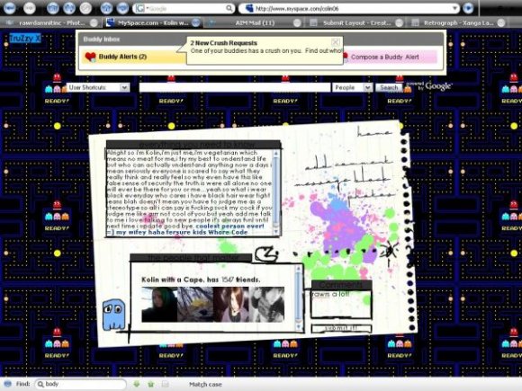
I think there's a place in the middle of the game where all these -you know, Inky, Blink, ect.- congregate before the gameplay, but 'during' the game it's empty I think. That would have been better (to me) as the place for the 'About Me' section, ect, instead of the white paper. The white paper looks random on the game and , well...'white'. Your work is inspiring me mentally which is why I always have so much to say. Your work really excites me; I don't mean any harm by my little comments here. xoxo


I like it but I don't think the paint splatters go with it. :/ Especially the colors of the paint because the Pac-Man stuff is like neon and the paint is pastel-ish.
Other than that I think it's adorable. ^^


i like this layout a lot but can i put something else in the scroll box instead of my top friends?

hey if you wouldn't mind, what computer programs do you use?
your layouts are adorable btw :)

Yeah it's a little off in IE but it's still pretty rad ^^


Just take out pac man completely and pick a good background and you've got a good layout
There's just too much going on

yeah the background doesn't go too well with the color scheme of the layout.

there is just a little bit too much going on im afraid.
and this background is too public, i've seen it quite a lot.

Well, the paper foreground doesn't go with the Pacman background at all. It also seems a tab bit brushy; the splatters don't seem very well incorporated either. It's like you just splashed them on without matching them to the overall layout.
The nav font is a bit to decorative for this specific layout.
I dunno... this one just isn't doing it for me. Maybe try again?

Add Comment
You must be logged in to comment
Layout Details
| Designer |
TruZzyx
|
| Submitted on | Apr 6, 2008 |
| Page views | 50464 |
| Favorites | 263 |
| Comments | 14 |
| Reviewer |
Relentless
|
| Approved on | Apr 6, 2008 |