Light Up The Sky (comments)
Displaying 21 - 40 of 47 comments


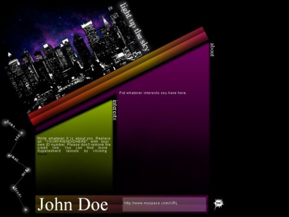
rofl. it looks like the town is sliding off the blog.. ( I LOVE IT! ) :D

add "margin-left:50%"
and you're also going to have to relocate the divs

How can I center the whole layout on the page.
I love it but would like it better if it weren't aligned to the left.
The tilt is interesting, but I think the layout would be better if it were just straight. Cute rollovers.

I love the theme mostly. I think the buildings could have a used a bit more green, imo.
Nice job :D
Hey! I'm trying to use a player from myflashfetish puting it in the interest side (yes, putting it in the " Put whatever interests you have here.
" section) and it cuts off the top part of the player and bottom as well. What am I doing wrong, here?!?! Please help!!!

I really love these colors & the concept. The style of this layout is pretty awesome, too. Really nice work.

Aw cool you made another layout. The nav is pretty tight, and I like how the content boxes fade as the go down. Great job.


i really like the colors you used and i like your navigation.
awesome layout.

i like the tilt but i don't think you should've tilted the graphic. the colors are nice. i like the gradient. im worried that since your link color is black, it won't be visible if it was at the bottom of the content. nice navigation. then again, i think this would look better without the banner. anyways, great job. :) i look forward to your next layout.

relly nice job and i like how it has a pretty nice content space, but the huge black space underneath is kinda weird . there is a slight resemblance to angeline's layout.

Add Comment
You must be logged in to comment
Layout Details
| Designer |
superednerd
|
| Submitted on | Mar 31, 2008 |
| Page views | 62828 |
| Favorites | 572 |
| Comments | 47 |
| Reviewer |
MissHygienic
|
| Approved on | Apr 1, 2008 |