Beauty (comments)
Displaying 21 - 37 of 37 comments

thawks330: sure go ahead. :) and thank you for reading.
twodreamlovers: I understand your point of view, although I like what I did with it. Theres no way I would change it because of a few points of view. But I will keep that in mind for the next lyt.
The ones who where talking about too much space to fill out; there is a lot to say about life, people just don't like to put it down. It doesn't have to be filled out with information, pictures and such is good.
The rest: Thank you for your comments and suggestions.

i like the saying under ale;s mind. i wanted to know if i could keep that on there but to change the name..
let me know :]

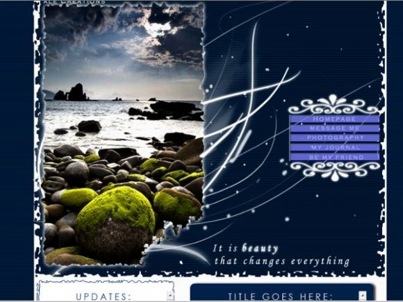
the picture is very beautiful. there seems to be too much content space. people don't usually put anything. i'm not sure about the edges...they seem so distorted. it doesn't match with the theme. i love the brushes and the navigation. im not sure if they really go with the picture. the colors just seem like the night rather than the day and like nature. but, well done. :)

the nav is a bit weird. is it supposed to flash crazily like seizureish like?

I agree with MakeDamnSure that there's maybe too much space to write.
It's not a bad thing, but most people just don;t write that much on their profile.
This layout is awesome though. =]
Great work.
And I love the photo.
Troy's got some super talent.
=]

You ALWAYS DO GREAT WORK! i really love the image...and yes a lot of people do take the world around them for granted :[

Simply Beautiful! You've Outdone yourself with this Layout Ale! Kudos To YOU!

This is a brilliant layout! I love it! It is wonderfully adaptable and so much text space to work with! The picture is gorgeous. Kudos! :D

Its really nice. Can you add a section at the bottom for the friends and comments?


It's really pretty, but maybe two content boxes instead of four would work better?
People on Myspace generally don't have that much to say
But it's really gorgeous, especially the nav


Add Comment
You must be logged in to comment
Layout Details
| Designer |
alecreations
|
| Submitted on | Mar 31, 2008 |
| Page views | 46577 |
| Favorites | 473 |
| Comments | 37 |
| Reviewer |
karmakiller
|
| Approved on | Mar 31, 2008 |