Hannah Montana (comments)
Displaying 1 - 11 of 11 comments


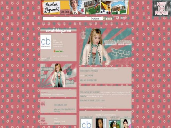
i think the background would have been better fixed.
and god that picture is wayy too photoshopped. I'm kinda biased against this i guess.

oh LORD! LMAO. hannah mo-who?
10year old girls are allowed 2
have myspace now?

oh lord..
hannah montana! lol
but yeah, i agree with everyone else.


The interests & details header text is near impossible to read.
And the text in the banner is kinda blurry.
Also, while I think the link hover effect you put on is neat, it looks really bad when you hover over the contact table (the boxes don't line up with the words).
You had a nice idea, it just needs a little tweaking. =]

nice layout.
i personally dont like hannah montana or miley cyrus, but i love the backround on this.

the layout is nice but there are acouple of things i'm not to happy about. the font you used for the lightbluetext i wanna say, is very hard to make out and the name that's in the banner is blurry. other than that, it's a really nice layout. the colors look great together!


nice layout i must say, but i cant stand Haannah Montana
Add Comment
You must be logged in to comment
Layout Details
| Designer |
socialoungeDOTnet
|
| Submitted on | Mar 29, 2008 |
| Page views | 13160 |
| Favorites | 15 |
| Comments | 11 |
| Reviewer |
agiri
|
| Approved on | Mar 29, 2008 |