Trash Love (comments)
Displaying 1 - 15 of 15 comments


It doesn't? I don't test the flash stuff out so I'm not sure. You may need to post in the support forum or something. I may test it out later.

is there any reason why it doesn't support flash movies inside the scroller section?
thanks

I really like it. It's different from all of the sappy love layouts. I might actually use this one, if I ever delazify myself.
SkeleBoy: Hmm, well I guess everyone just has a different view on it. XD I think when I was making it, I was sort of thinking of someone in denial or something. You know, like when a couple breaks up, usually one of them is depressed or something and is like, "Screw this... I don't need this!" -shrug-
It all depends on how you look at the layout. Alecreations has a very, very good alternative to the concept of this. :]
I'm a very abstract and in-depth person. xD I hate simplicity. I enjoy hiding things around and whatnot. :] And I have fun with contradictory themes or.. well. Mind-games in general. xD
Everyone else: Thanks for the comments! :]

this is simple and different. in a good way. i really like it.

I love love love, the main concept of this. too many love layouts, i agree. & contrary to skeleboy; the image does match what you are going for in my opinion. Love doesn't always have to have a heart next to it in order for people to get it.
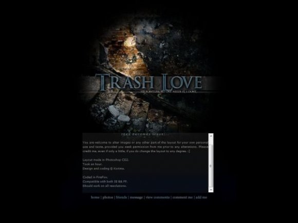
My point of view: The smashed up stairs and the wall signify the strength that love once had and how it all simply destroyed. "relationship" you have to move your way up, continue, and have something to back you up. This case, it has shattered.
Great work!

I love the header background image, and the concept is neat, but I don't really see how the two go together.
Maybe it's just me, but I don't really think a broken down wall/staircase goes with an anti-love theme.

Actually, I really WAS going to put rollovers. And then I got lazy and was like, "Ahh, hell with it.. x]"
Mm, content shouldn't be off when you put it on your real myspace. The live preview ALWAYS screws up when I put my layouts up. o.O Even if only a little. I wonder why, really. >.< Probably the way I'm coding it, is all.


simple but bold. i like it. i wish you would've at added rollovers since the layout is simple. i like the concept of this. and you also managed to create a dark layout without making the font ineligible. and the content position's a bit off. it's placed a bit higher than the background.
Add Comment
You must be logged in to comment
Layout Details
| Designer |
Korima
|
| Submitted on | Mar 24, 2008 |
| Page views | 25090 |
| Favorites | 138 |
| Comments | 15 |
| Reviewer |
Relentless
|
| Approved on | Mar 25, 2008 |