Designer's Comments
Look carefully for specific instructions
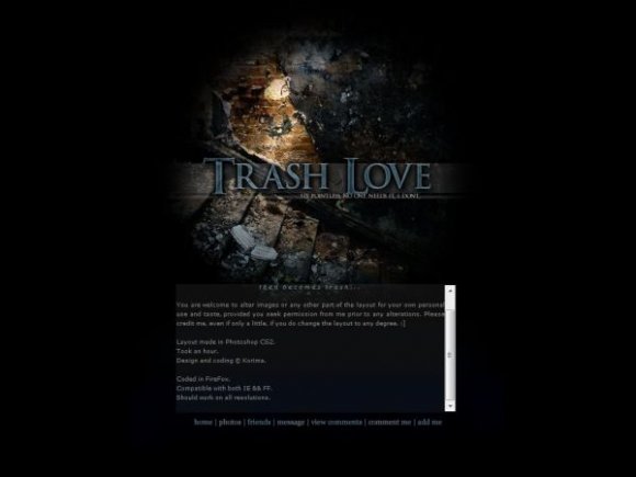
I don't know what people will notice when they see the layout, because I know where everything is already, and since I already see it, I can't not see it anymore. D: There's a little heart about an inch above the space between the A and S in "Trash." And my credit is reaaaallly teeny between "Trash" and "Love." There's a slight fading in the content box; I don't know how it appears on different screens, though. My screen is darker than most computers, I think. I didn't bother to change the brightness and contrast. o.O
Was going to put rollovers. Then I got lazy. :] Maybe sometime later I'll put them in, so check back for any updates this weekend or something, if you really want to see it, if I even do it. XD
The layout should work in all resolutions and browsers. If there're any kinks or issues with it, don't hesitate to tell me. If you want to use this in IE, find the number "741" and change it to "731" and everything should look fine.
Replace all instances of "XXXXXXXX" with your Friend ID. :]
December 28, 2008: Code slightly updated.
Okay guys, I won't be on CB much mostly because I make MySpace layouts and Myspace keeps changing its stupid coding which makes it hard to code the layouts for me.. and I'm lazy. x] Sooo if you need me, e-mail me at cryptic_simper@yahoo.com. ;D
Using This Layout
For specific instructions read designer's comments
- This is a div overlay layout, html knowledge required!
- 1. Log into myspace.com
- 2. Click on Edit Profile (Profile 1.0)
- 3. Copy (ctrl c) and paste (ctrl v) code to the specified fields
Layout Comments
Showing latest 10 of 15 comments

ooh, this is neat!

It doesn't? I don't test the flash stuff out so I'm not sure. You may need to post in the support forum or something. I may test it out later.

is there any reason why it doesn't support flash movies inside the scroller section?
thanks
Hope you don't mind if I alter a few stuff. Thanks!

I really like it. It's different from all of the sappy love layouts. I might actually use this one, if I ever delazify myself.
SkeleBoy: Hmm, well I guess everyone just has a different view on it. XD I think when I was making it, I was sort of thinking of someone in denial or something. You know, like when a couple breaks up, usually one of them is depressed or something and is like, "Screw this... I don't need this!" -shrug-
It all depends on how you look at the layout. Alecreations has a very, very good alternative to the concept of this. :]
I'm a very abstract and in-depth person. xD I hate simplicity. I enjoy hiding things around and whatnot. :] And I have fun with contradictory themes or.. well. Mind-games in general. xD
Everyone else: Thanks for the comments! :]
The colors are great. I like the theme and navi.

this is simple and different. in a good way. i really like it.

I love love love, the main concept of this. too many love layouts, i agree. & contrary to skeleboy; the image does match what you are going for in my opinion. Love doesn't always have to have a heart next to it in order for people to get it.
My point of view: The smashed up stairs and the wall signify the strength that love once had and how it all simply destroyed. "relationship" you have to move your way up, continue, and have something to back you up. This case, it has shattered.
Great work!

I love the header background image, and the concept is neat, but I don't really see how the two go together.
Maybe it's just me, but I don't really think a broken down wall/staircase goes with an anti-love theme.
Layout Details
| Designer |
Korima
|
| Submitted on | Mar 24, 2008 |
| Page views | 25,089 |
| Favorites | 138 |
| Comments | 15 |
| Reviewer |
Relentless
|
| Approved on | Mar 25, 2008 |