Monsters In My Pocket (comments)
Displaying 1 - 17 of 17 comments

this is the first layout I used when I found createblog, and I still find that it completely amazes me. I love your work. Looking through your older layouts I can see how much more skilled you've become and how much more dramatic your layouts are.

what type of coding do you use for your overlay? i'm interested in learning how to create my own.

What boxes? there's only two columns, and you can delete the extra sections.

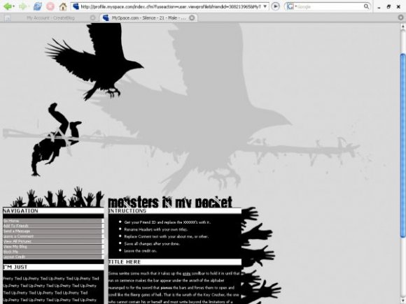
i like it. but it has a lot of random boxes. and it looks like the "monsters in my pocket" words are cut off. good tho.

i dont get what the silhouette of the guy breakdancing has to do with anything :x

basically the same comment i left on your previous layout. the layout itself does seem fuller though. :)

It's some kind of complex simplicity I've got going on here, it's not too simple, but it's not complicated.

I love the simplicity. :D I envy people that can make simple layouts. I can't stand making them, myself. xDD It aggravates me.

I like it! I love how it's black and white..there's so many other colorful layouts. ^_^

this is a nice improvement on your previous work...somehow?!
could do with a little more colour..the hands are very interesting though.
its unique.
Add Comment
You must be logged in to comment