Designer's Comments
Look carefully for specific instructions
so do the usual, replace the XXXXXX's in the Who I'd like to meet, with your friend ID, and replace the content with your own, and leave the credit intact.
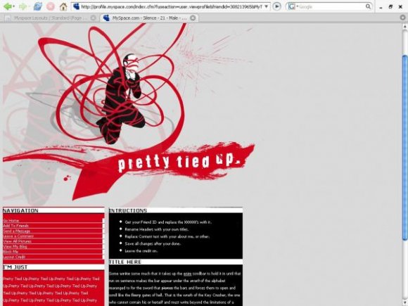
Image by: Fullbleed.org
Using This Layout
For specific instructions read designer's comments
- This is a div overlay layout, html knowledge required!
- 1. Log into myspace.com
- 2. Click on Edit Profile (Profile 1.0)
- 3. Copy (ctrl c) and paste (ctrl v) code to the specified fields
Layout Comments
Showing latest 10 of 11 comments

lol what the fuck @ the comment below.

Hello.
My name is Miss favour,i saw your profile today and became intrested
in you,i will also like to know you more,and i want you to send an email to my
email address so i can give you my picture for you to know whom i am.Here is my
email address (favour50williams@aol.com, ) i believe we can move from here. I am
waiting for your mail to my Email address above. Remember the distance or colour
does not matter but love matters allot in life Yours Love. pls contact me back
with this email address here (favour50williams@aol.com, )thanks.pls don't write
me on the site,please remember that i see others,
but i see you as the best,

I love FullBleed, so glad someone made a layout with it ^_^

love the graphic! one more color and a less simple content area would of donr this some good though :]

aw!
i was working on this one too.
:(
its an awesome layout though.
:)

love it too!!

that is one sick graphic (that's a compliment) overall it seems very clean and structured. however, it does seem plain. because of its color combination, you might want to throw in another color that complements the combination. since your banner is simple, you might want to play with your content area. little details matter. very nice. i see improvement from your last layout.
Thanks everyone, and well I guess you could move a flash player up there or something.

this is new.
in a unique way, lol.

this is a very nice image.
i dislike the box in the top left hand corner above the image..but thats me being picky!
the nav is nice as well. a very nice concept and structure.