Death Note. (comments)
Displaying 1 - 13 of 13 comments


I like this a whole ot.
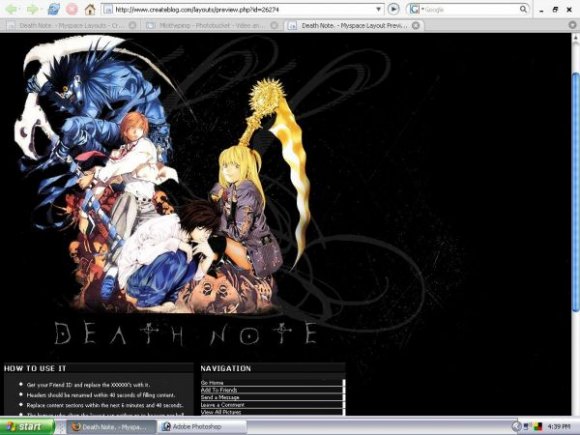
But the swirls on the right side of the layout don't seem to work well with it.

I agree on the swirls.. they seem soo out of place. Also the background would look best in black to match the header and the rest of the layout for those who have a bigger screen resolution. While its nice to see another Death Note layout, the css can be altered a bit. overall its a good layout.

im not sure about the swirls. i love the images you chose. the layout seems a bit plain. maybe adding some colors for different font styles might help. make "Death Note" contrast more with the background (make it more legible) structured nicely and clean. good work. big fan of dearh note

OMG!! i love death note!! you did such a great job!! i love it!!


Death Note is awesome and this layout is awesome!
I like how you made the "How to Use It" module into a little Death Note rulebook. Very creative!


Really? I coded it in FF. and the "Death Note" looks big on my screen.
The "Death Note" looks a little too small. I think the font size should be bigger and/or bolder. You should make more layouts with this kind of setup. Nice work.

in firefox, this is just slightly mis-aligned. Other than that, great job.
Add Comment
You must be logged in to comment