Bye Bye Beautiful (comments)
Displaying 1 - 15 of 15 comments

in response to naekipz, that is ONLY on the preview :)

It's fucked up on IE. You can see two boxes behind the overlay, and it says Myspace URL. Oh and you really outta get rid of the google toolbar.. Same thing happened with the teal layout like this one. See for yourself: http://tinypic.com/view.php?pi c=2rwswn8&s=4

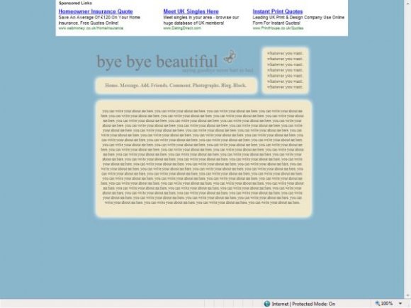
bye bye beauitful should be replaced with a cool font that we can put our name.
thankyou for the comments everyone, anyone got any ideas about font colour you lot would prefer?
i will update soon.

I love this. Beautiful and simple.
If it just said "bye bye beautiful" without the extra bit, it would be extra fabulous


i like it alot but in FF it seems to either have cut off at the sides or something. but i love it to bad i cant use it.


I really would have loved this layout if all it said was "Bye bye beautiful."

Apart from the font color, this is pretty/great. :) good job overall.

yeah, i agree. i think if you used a lighter color, it would have really stood out.
but the layout is cute overall. great job.

Eh, I think the only flaw is the gray text. It would have been better if you used a different color I think.
Add Comment
You must be logged in to comment
Layout Details
| Designer |
vintage-toile
|
| Submitted on | Mar 12, 2008 |
| Page views | 18306 |
| Favorites | 108 |
| Comments | 15 |
| Reviewer |
Insurmountable
|
| Approved on | Mar 12, 2008 |