Simply Sombre (For Myspace) (comments)
Displaying 1 - 20 of 21 comments

hey!!
i love this layout itz amazing
itz simple yet totally cute
but i just have 1 questio how can ppl cmt my pics?
lyk where do they have 2 click?


You dont have to change where it says "navilink", you only need to change where there are "XXXXXX"'s. :)

hey well done on an awesome layout;
im just having some difficulty with putting the picture up;
i've tried so many times buh it just doesnt seem to work and its getting on my nerves lmao;
i'd really appreciate the help buh if you cant then thats fine
xxoo yassiiee

Love this layout. :) Could you please add more grey navigation bars for blog, pictures, view comments, home, etc. Thank you!

Um, you can define background colour that way, it works just as fine as background-color just takes up less space. This is common with layout designers that want to add other stuff (like borders and images and stuff). There's nothing wrong with it, if you knew HTML as well as you say he doesn't you'd know that.
Lovely job on this, Crotchet. It looks amazing =] (and it looks fine in firefox. At least for me.)
I know how to define the background color, smart ass. I made a mistake; that doesn't make me incompetent.
I may not have Firefox, but I'm going to do what I can to fix it for that browser.
And please don't condescend to me; I understand that I'm still learning. Everything I know about HTML, I taught myself. I do all my layouts with nothing but Internet Explorer and Microsoft Notepad.
I'm very proud of the work I've done, and if you have a problem with that, you can at least be polite about it.
That's everyones excuse and the truth is you don't know HTML (at least not that well). Hell, you're defining the background color with "background: #color code" WTF is that? Define background color by actually doing "background-color."
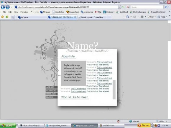
(background doesn't show up, and the navigation isn't aligned with the background image)

simple but very nice. im not sure if it's the font family or the size but the words are hard to read. maybe the color? anywho, nice job. and i do agree about this being similar to fainaru's work. i thought this was fainaru's.

yes It does remind alot of fainarus layout, and I love his laouts so its a good thing haha. Its a little mess up in FF, or it could be my computer, It veary pretty and I love the nav but I think I smaller font would be better since its s samller and more minimal layout. Great job :]
Add Comment
You must be logged in to comment
Layout Details
| Designer |
CrotchetTheLeper
|
| Submitted on | Mar 8, 2008 |
| Page views | 35024 |
| Favorites | 323 |
| Comments | 21 |
| Reviewer |
MissHygienic
|
| Approved on | Mar 8, 2008 |