Red&Blue...thing (New Nav) (comments)
Displaying 1 - 16 of 16 comments

After using this layout, I have a strange youtube video on the top left of my profile, only showing the play/pause, and volume buttons on the bottom, and a small part of the screen.
Did you add this within the code? and is there a way to delete it?

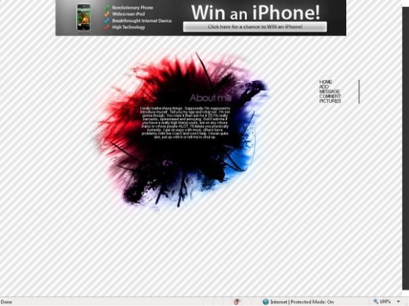
I'd try to attach the nav to the red and blue...thing. Nice concept, if a little squashed.
I've seen a few layouts on here that have the same basic idea of this one, but I do really like the colors you used.
The nav seems a little blah
Everything else is nice though.


i would love it so much more if the navi wasnt so bleh >.

The navigation is totally in the wrong place and is just standard myspace colors. (Im using Firefox 2)

Ohh. The colors remind me of the French flag. But I really like the black blob thing.
Add Comment
You must be logged in to comment
Layout Details
| Designer |
Decode
|
| Submitted on | Mar 7, 2008 |
| Page views | 23494 |
| Favorites | 145 |
| Comments | 16 |
| Reviewer |
Insurmountable
|
| Approved on | Mar 7, 2008 |