One Dollar Bill (comments)
Displaying 1 - 19 of 19 comments

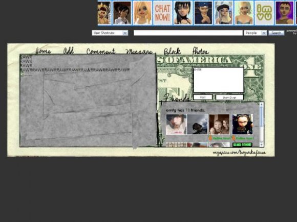
P.S. Srry:( Or better yet, instead of the grey area, it could have been part of those enveloped the bank gives people when they give them money, that has the bank's name & info on it. But I'm rambling on here....See how your work inspires me?
It should've been called 'Another Day, Another Dollar'. This is a great idea: you have a LOT of original thoughts and ideas on here which in my mind is setting your stuff apart from a LOT of other material. You're not just regurgitating images and 'adding grunge brushes and that person's name' and submitting it. But my only thing with this is the 'grey areas here. Maybe it would have been better hidden to make those areas like the grey binding tape you used before? Like the dollar had been torn & the tape is holding it together & just use that for the 'About Me' area, ect.? Just my little 2 cents.
But anyway, I love your ideas regardless:D


i luv tha fact that i dnt have to link my friends onto tha page.... awesome


you put two comment things
a box and a link
but it can easily be fixed
nice job!

i like the idea, but not my style. two thumbs up on creativity. :)


creative, nice set up, and rollovers are always good :]. but the background could be better and the comment box could be in a better place maybe?

yeah. just saying that on IE for me, the friends section is a bit misaligned. but still pretty good.
woudlve loved it if it was 100 though ;]

Solider, keep your comments to yourself. If you don't like it, then don't comment it! Or you can say what you don't like about it, but saying it "sucks ass" is rude.


Very creative; the background doesn't quite match the theme and the text does need to be brighter, but great concept.

I would do some things a little differently, but all in all it's very creative. Good job!
Add Comment
You must be logged in to comment
Layout Details
| Designer |
TruZzyx
|
| Submitted on | Mar 4, 2008 |
| Page views | 24386 |
| Favorites | 96 |
| Comments | 19 |
| Reviewer |
Insurmountable
|
| Approved on | Mar 5, 2008 |