Designer's Comments
Look carefully for specific instructions
**If this layout seems misaligned in the Createblog Preview - REFRESH the page. This is a CB error only and will not happen to your own Myspace page. **
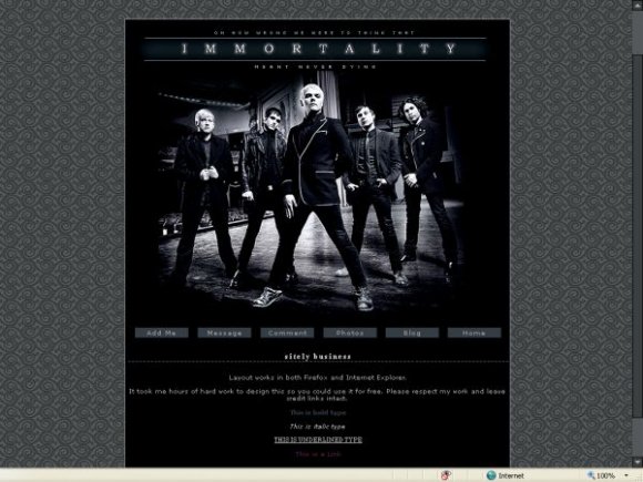
This layout will work in Mozilla and Internet Explorer, although looks slightly better in IE.
Look for 'YOURFRIENDIDHERE' and replace that with your friend ID. Simple.
It took me hours of hard work to design this so you could use it for free. Please respect my work and leave credit links intact.
Background credit to: squidfingers.com
Visit A Touch of Destiny for more quality, pre-made Xanga and Myspace layouts.
Using This Layout
For specific instructions read designer's comments
- This is a div overlay layout, html knowledge required!
- 1. Log into myspace.com
- 2. Click on Edit Profile (Profile 1.0)
- 3. Copy (ctrl c) and paste (ctrl v) code to the specified fields
Layout Comments
Showing latest 10 of 14 comments

Really cool. :)

I just about crapped myself when I found this layout. I couldn't seem to find one that I needed. It's perfect except for that when I insert a picture using the typical code, it blows up to a size that takes up about half of the entire part where you can enter text and such, and becomes blurry and pixelated. Could you please fix the problem? It would be a shame to have to hunt for another layout; this one is so good.

effinly awesome! =]

MCR Rocks!
i love this layout. very "clean" compared with others ive seen.
This is an absolutely awesome layout, and I really really want to use it..but whenever I use a code for a picture to display on there, the size gets increased and it becomes all pixelated. Any idea on how to fix this?

Very Clean and not busy at all. I love it!

very nice. clean and simple. i think you could've had a bit of brushwork on the banner. the color for normal links is dark violet...random? anyways i like it.

Wow, this is amazing. I love it! =]

this is pretty awesome. im not a fan of mcr but i still like it. nice job.

Nice. I love the background. :)
Layout Details
| Designer |
S-Majere
|
| Submitted on | Feb 28, 2008 |
| Page views | 23,144 |
| Favorites | 108 |
| Comments | 14 |
| Reviewer |
Dominatrix
|
| Approved on | Feb 28, 2008 |