Electropop. (comments)
Displaying 21 - 33 of 33 comments

This is very nice. I like the colors and I love the text space. The navigation is pretty cool too.
Posted by jesusisthebestthing on Feb 26, 08 10:17 pm


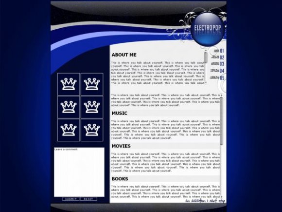
Strive: Because of the blue glow, I had to make it as big as it is; otherwise, it would've looked awkward. This layout is preferable for people with bigger monitors.
Posted by MissHygienic on Feb 26, 08 7:38 pm


i like the sparkly/glitter brush. or whatever you used. and i love the glossy look too :]
Posted by michellekdo on Feb 26, 08 6:25 pm


I like this one much better than the 'vicarious' one.
It flows much nicer and is much more visually appealing.
The shine effect on the black banners is really amazing as well. They look super-polished.
And the mirror effect at the bottom is very neat.
Posted by SkeleBoy on Feb 26, 08 6:07 pm


« Prev ·
Page 2 of 2
Add Comment
You must be logged in to comment
Layout Details
| Designer |
MissHygienic
|
| Submitted on | Feb 26, 2008 |
| Page views | 20744 |
| Favorites | 111 |
| Comments | 33 |
| Reviewer |
mlothepimp
|
| Approved on | Feb 26, 2008 |