Electropop. (comments)
Displaying 1 - 20 of 33 comments

this is a real good layout but it hides the myspace add on top an i dont wanna get deleted


This is a great layout =)
The colors are just stellar.
Everything works out perfectly.
But the thing Im not very fond of is the reflection on the bottom.
It seems like too much.

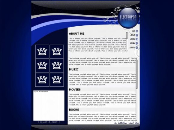
I don't really think "electropop" is a good name for it, I was expecting bright, poppy colours, but that's just how my mind works, it's gorgeous.


i love hows there so much space. and the blue is awesome. :D!

Charliezac: Thank you for being one of the most sensible people that has commented.

the problem with most createblogs profile submissions, is that they look like 12 year olds do them. not a lot of people want a narrow div with a huge pic of daniel radcliffe, and very little room for personalization. thats why i like yours. keep up the good work
Take one section out? I had, "Music" twice and didn't realize it. It's just to emphasize the scrollbox. Christ.

Aren't books and literature the same thing? Why did you put two different sections?
hi, i'm making a myspace for a kava business n i need a layout n html to help guide me. do u mind if i copy this one? i'll give u complete credit on the page.

Very clean. Doesn't view best in IE though. Looks good in FF. Might want to try and scoot the div a bit more over towards the right somehow for it to view "just right" in IE as well. =] Other than that, looks pretty good.
The crown brushes are just substitutes so that it shows you can put your friends' pictures in there. . .

i definitely like the shine and the blue and white looks very clean. i like the crown brushes (have some) but i don't think they go along with the rest of it. i almost feel the same way about the brush you used behind the electropop circle/bubble.
Add Comment
You must be logged in to comment
Layout Details
| Designer |
MissHygienic
|
| Submitted on | Feb 26, 2008 |
| Page views | 20765 |
| Favorites | 111 |
| Comments | 33 |
| Reviewer |
mlothepimp
|
| Approved on | Feb 26, 2008 |