Nevermore. (comments)
Displaying 1 - 20 of 30 comments

I love this layout.
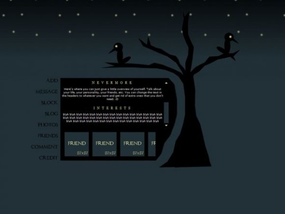
It kinda made me think it was Sleepy Hollow themed by the tree =)
Love it!

this layout is awesome, thanx
i might use it next time i change my profile

Thanks guys. Rollovers are overrated. They're cool, but you don't need them for your layout to be good.

This layout is amazing :)
i really dont see whats so great about roolovers anyway,
half the people on myspace don't appreciate them anyway,
this layout it excellent without them :)

This is cute, simple, nav is a bit plain but yeah with rollovers it would give it more. Wonderful work!

ROLLOVERS ARE OVERRATED.
Love the layout. Very much considering using this one.

Nice poem it is :)
A bit too grim though.
Nice layout too! You should make another one to this poem, but more in Victorian style and with more details.


I really like this layout. One of my favorite poems, too!

this layout is lovely, very easy on the eyes. I love how dark it is!

I agree with twodreamlovers and SoEffinMajor about having glowing rollovers; that's the only thing that could be improved about this layout. Otherwise, it's good!

I wrote a blog previous to finding this layout and its like you took it from how i described my thoughts. Whoot!

This is very nice. I love the font on the navigation, I would've appreciated some glowing rollovers to match the nighttime theme. I think the friends list is a little weird and possibly something else should go there. Either way, I love the colors and you've done a great job overall.

beautiful. simply FLAWLESS! i just LOOOVE this. you should add rollovers so that when you hover, the link shines. this is like one of those layouts that is just AHMAZING!


This layout has to be my favorite layout out of the entirity of CB's database. Something about this design just clicks with me. Absolutely genius. x
Add Comment
You must be logged in to comment