Vicarious. (comments)
Displaying 101 - 120 of 122 comments

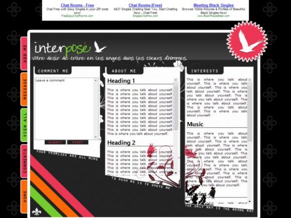
Thanks guys for the comments. What you've all addressed were conflicts I had in my head, but I went ahead and uploaded it. I thought three different fonts would be too much "clutter."
I was hesitant to put too much text, and the empty space bugs me, too, but it honestly looked really ugly if I put anything else in there.

Hmm. Now that I've looked at this for a second time, I must say that, personally, the font looks good in the headers of the three content boxes, but not so much in the navigation tabs on the left. Err, unless those are two separate fonts. But again, awesome job.


love it. it's so unique. i like the slanted edge. i think it'd look better with rollovers. i see a lot of pink, you might want to change some of them to orange. you should move the white flowers to the bottom where there is a blank space. love the colors & the structure. keep up the good work.


misshygienic, when you do post your layouts, you sure make the best darnest professional layouts :). It makes Myspace's layout look bad, heehee.
I love this. I'm just not fond of the font you chose for the tabs on the left. But otherwise, everything looks great.


omfg ii love dizs layout so much jzst everiithiin bout iit iizs spp effiin keeeewl1

this is beyond awesomee.
i love every aspect of this layout.
the colors. the little tabs on the side.
mos def faved. lol.


i love this layout but i was wondering if there was a way to incorporate the music player somewhere

Oh my god, I'm sorry, guys. The layout code got cut off. I'll edit it.

or is it just me and my computer? :O i checked on firefox and there was like the html codes in the textarea. still no submit button.
Add Comment
You must be logged in to comment
Layout Details
| Designer |
MissHygienic
|
| Submitted on | Feb 25, 2008 |
| Page views | 146678 |
| Favorites | 1382 |
| Comments | 122 |
| Reviewer |
mlothepimp
|
| Approved on | Feb 25, 2008 |