D E L U S I O N A L . my nightmare . (comments)
Displaying 21 - 30 of 30 comments

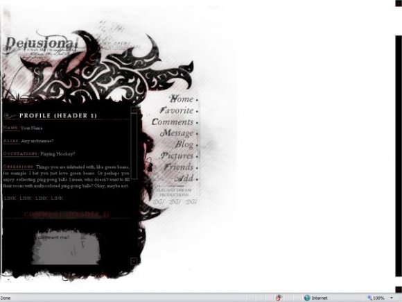
I like it aligned to the left.
Grungey yet not overdramatic.
Great Lsyout.
I love this layout, a lot of work was obviously put into it. I just think the whole right side looks plain. A project playlist would look awesome over there, or a video. =]

Nice. I love the grungy style. Personally, I think I like it better left aligned than I would centered. =D


This makes me smile. I admit I would prefer to see this centered, but the work you put in is obvious. I really like this.


i think it looks fine to the left. nice roll overs. good job :]

Hmm, interesting. Thanks for letting me know that, SkeleBoy. I did preview it on a widescreen computer but didn't notice anything. Your wide screen must be bigger than mine.
Anyways, I made the div area bigger and changed its background color from transparent to white. Hopefully that helps.

Very nice.
Only problem I see is that on my screen, the blue tables stick out from under the right side of your div.
I have a widescreen computer, but still.
Otherwise, it's a very nice layout. =]
I love the fonts.

Add Comment
You must be logged in to comment
Layout Details
| Designer |
Tasare
|
| Submitted on | Feb 24, 2008 |
| Page views | 57984 |
| Favorites | 451 |
| Comments | 30 |
| Reviewer |
Relentless
|
| Approved on | Feb 24, 2008 |