D E L U S I O N A L . my nightmare . (comments)
Displaying 1 - 20 of 30 comments


wat r the things that say link do i put sumthing there or wat cause idk wat that is

FOR UR FRIEND ID READ:::: LOG INTO MYSPACE, CLICK VIEW PROFILE. THEN LOOK UP AT THE URL BOX. CLICK BETWEEN 2 LETTERS, AND KEEP CLICKING UR RIGHT ARROW KEY. TOWARDS THE END OF THE URL ULL COME TO SOMETHING THAT SAYS FRIEND ID= ANDTHERE WILL BE 8 OR SO NUMBERS. SO ITLL LOOK LIKE FRIEND ID=45632145&ETC ETC. COPY THOSE 8 NUMBERS, AND WAM BAM THANK U MAM U GOT CHA FRIEND ID! LMAO HOPE THAT HELPS.

love it .. can i ues it if i can .can you tell me where can i find my friends ID on myspace

This is news to me. I'm viewing it in Mozilla right now and everything works perfectly fine.
it's beautiful, but picture and the rollover effects don't work at all on Mozilla.


Im kinda new here, but wats the users ID number thing mean?? Do i have 1? or where do i get one?? Thanks!
Hey love this! but im pretty new to div's and i always have problems. And with this, mine seems to be that i cant find the ######'s to replace. so, no one can comment or message. Id really appreciate it if you could help. I think this is an amazing layout!

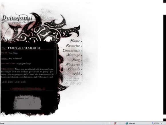
I absolutely love the tribal-looking design at the top.
The fonts are pretty sweet too. =]
This layout is really awesome.
Only problem for me is the huge white background space, but I have a wide-screen monitor, so it's exaggerated on my screen.
Otherwise, great job. =]

i love the tattoo-esque deign :)
and the rollovers work great,
i dont usually think theyre neccessary,
but these are fantastic :D

Love the comment box & navigation.
Not much of a fan of the picture, but it's still a good layout.
This is gorgeous. The left-align works better than centered would have.

very nice. this looks like a lot of effort was put into it :D

i think it'd look better if it was centered. i like the colors. i'm not sure about the dark red, it's not that legible. you should get rid of the dots next to each navigation link. nice rollovers. simple but effective. you might want to get rid of the vertical line where the dots are located or fade it along with the edges. nice brushwork. this is great. i've always loved your work.

*dies* This...This is fabulous!! It's absolutely beautiful! Dang, and you used Anberlin's lyrics too. xD Wow...Fabulous job!

Add Comment
You must be logged in to comment
Layout Details
| Designer |
Tasare
|
| Submitted on | Feb 24, 2008 |
| Page views | 57984 |
| Favorites | 451 |
| Comments | 30 |
| Reviewer |
Relentless
|
| Approved on | Feb 24, 2008 |