Grunge Floral Kontrast (comments)
Displaying 21 - 26 of 26 comments

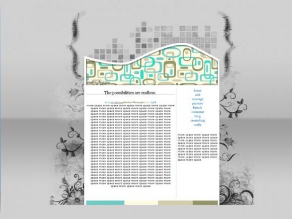
i likee this alot, but could you make the table a bit smaller?
Posted by nycutie109 on Feb 21, 08 12:13 pm

I like this, but I think the navigation brought the layout a little down. It would have been better if the navigation was more formal. great overall.
Posted by alecreations on Feb 21, 08 11:17 am

Cool. I like the design a lot. It wold make a nice website template too. =D
Posted by Venia on Feb 21, 08 8:37 am


« Prev ·
Page 2 of 2
Add Comment
You must be logged in to comment
Layout Details
| Designer |
crafty-designs
|
| Submitted on | Feb 21, 2008 |
| Page views | 39915 |
| Favorites | 357 |
| Comments | 26 |
| Reviewer |
S-Majere
|
| Approved on | Feb 21, 2008 |