The Sky's The Limit (comments)
Displaying 1 - 12 of 12 comments


Why is everything so far to the left? I can't see everything.


Thsi layout is great! Question: is there a way to add a blog button? I don't know how people can view my blogs now.
i really like this layout & i really want to use it but the only thing i hate it the bold italic strikethrough etc signs, how can i get rid of that, apart from that evetything is beautiful.
Good Job (y)

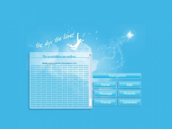
the nav is professional looking so it kinda clashes with the fantasy-like theme. it feels fantasy to me, at least (it's a good thing!) i love the brushwork/images/whatever you used xD!

Great colors, nice layout. It's very pretty. I love the quote, too.
The navi doesn't suit the layout, but, overall, it's still really awesome. xDD

Yeah I have to say the same thing about the nav. It sticks out like a sore thumb. Fantastic image though. :)

yeah i agree with drama and twodreamlovers. the image is beautiful!!!!

very nice. love the image. why don't you try taking out "navigation" and add rollovers? :] not sure about the content. i think you can make the opacity greater? anyways, very nice. love your works.

really pretty! but the nav bugs me a little. good job though.
Add Comment
You must be logged in to comment
Layout Details
| Designer |
crafty-designs
|
| Submitted on | Feb 18, 2008 |
| Page views | 13845 |
| Favorites | 126 |
| Comments | 12 |
| Reviewer |
mlothepimp
|
| Approved on | Feb 18, 2008 |