City Beats (comments)
Displaying 1 - 14 of 14 comments


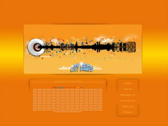
the content area looks low quality but I love the image.


The banner and rollovers are cool! =D
Content area is alright for me. =P
Still good though.


looks awesome. i love the rollovers; they add a professional touch. if you dont mind me asking, where did you get those cloud brushes? i've been looking for something like that o_o''
Love it. =) Does the section where you can write scroll? =/
Nice rollovers. =]


I agree with Drama and twodreamlovers...The banner is super cool but the content area doesn't really match.

love the image and the rollovers. im just not sure about the content. the colors you chose don't really compliment the banner. but good work on the image.

you images are always wonderful! but i don't really like the content area. grat job though :D
Add Comment
You must be logged in to comment
Layout Details
| Designer |
crafty-designs
|
| Submitted on | Feb 16, 2008 |
| Page views | 23066 |
| Favorites | 121 |
| Comments | 14 |
| Reviewer |
MissHygienic
|
| Approved on | Feb 16, 2008 |