Designer's Comments
Look carefully for specific instructions
so I give you a choice.. if you want Jpeg (poopy quality=loads faster)
and the Jpeg code is at the bottom of the ABOUT ME..
if your gonna use it or not remember to delete it.
it looks bad with a URL just hanging out in the back.
should I change the image to JPEG to make it load faster?
it gives this weird fuzzy look to it but I mean if you want me to I will in a flash
I HAVE MADE THE NAVI WORK ON BOTH INTERNET EXPLORE AND FIREFOX PUT A SMILE ON =]]]]
THIS LAYOUT WAS MADE WITH MOZZILLA FIRE FOX & WILL FOREVER LOOK BETTER IN IT
and yeah know your html and don't ask questions..
kay thanks =]
okayy!!
your comments got me going
I will put the links in for you so all you have to do is replace 8 little X's, XXXXXXXX with your friend ID =]]
and the link the ADD navi takes you to is ME =]
replace mine with yours =]]
my ID is 27952433
=]]
add if you wish..
agh I had to put the tag on there this layout is getting a lot of views like fast.
more publicity and I probably will send a link to my layout site.
www.myspace.com/rawr_damnit_inc
but maybe not =]
IF YOU WANT A CUSTOM MUSIC PLAYER REVERSE THE POST AREAS
POST ABOUT ME SECTION IN I'D LIKE TO MEET SECTION
AND
POST I'D LIKE TO MEET SECTION IN ABOUT ME SECTION
GOT IT!
=]]
and if you don't use your own custom music player then just leave it =]
kay thx =]]
RAWR
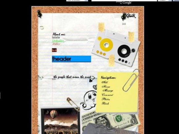
oh and taping a tape is just that
its taping a tape
don't ask questions I made this with my best Friend Colin With A K =]
Using This Layout
For specific instructions read designer's comments
- This is a div overlay layout, html knowledge required!
- 1. Log into myspace.com
- 2. Click on Edit Profile (Profile 1.0)
- 3. Copy (ctrl c) and paste (ctrl v) code to the specified fields
Layout Comments
Showing latest 10 of 30 comments

P.S. I love the heavy duty grey binding tape at the bottom. Nice 'realistic' touch.
Oh I didn't see this one before! How cute! I love cork, bulletin boards, and the junk stapled to them! So, this layout has a place in my heart :}

very cute :D

Love the design but I think that the link names under the navigation should look more "hand written". The same goes for the,
"lalala Bold!
Underline
Italics
l ink"
at the top. Why would something look 'computerized' on a 'hand written' page?
Really nice design though. :)

Very cool. I like the creativity of this. Great Job! :)

this is so awesome. i'm totally gonna use it.

everything works, :)
p.s i like it.
p.p.s i jsut dont like how the about me words are so large, but that only my opinion .
very nice...

everything works great! but the music :p
any way to get it to work?
i already checked my settings for my music player.
I cant get music on my page HELP ME PLZZZ
this layout is really good, except one obvious part, the background colour, may u by any chance offer another colour option, such as bright colours like yellow, light blue, light green, or even white, cause if u do so, the layout will look perfect, hope u do read this comment and do accept and do something on it. Thx man
Layout Details
| Designer |
TruZzyx
|
| Submitted on | Feb 14, 2008 |
| Page views | 108,681 |
| Favorites | 702 |
| Comments | 30 |
| Reviewer |
mlothepimp
|
| Approved on | Feb 15, 2008 |