Lose Yourself (comments)
Displaying 1 - 12 of 12 comments

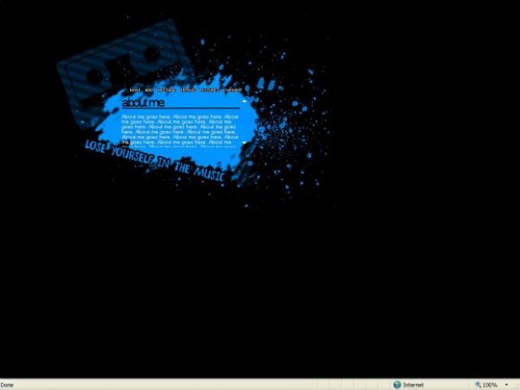
nice layout:), but i have a problem with links(cmnt, add, pics...) can you help me?
i've done all you said...but when i clik the link there's no change,it only refresh my profile...

This is a very nice layout, just like all your other ones. :)

hey dude can u teach me how to make this kind of div i have a pic ture with all these spots for stuff could i make it plz messege me

nice. and it's simple. i like that. i like how you have black outline for the navigation. more legible. i think you could have a simple brush on the right side to balance the layout. have more variety of colors and add rollovers if you can. gj.
Ooh, nice! =D
I think it would've been better if it was positioned in the middle, but still a good layout. ^^


Ok. If you're going to comment on it, do me a favour and read the comment I put on it! Getting tired of saying it.
I found them on deviantart I think. Most of them anyway.

Where did you get the brushes you used on Smudge, Hysteria and this?


problem am i supoose to see the stats in the back of the lay out

Add Comment
You must be logged in to comment