Juno (comments)
Displaying 21 - 34 of 34 comments

dont like the handwriting font too much, but everything else is stellar!

i love the layout but i think u could have something diff with the nav


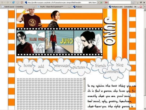
have the quote be within the white area. a bit too stripey and orange. smooth out the edges of juno. rollovers would've been nice. it's simple and well made. i like the images you chose and i just loved this movie.


How do i code a layout, a DIV overlay one ?
I just got one made of me for my myspace but i don't know how to code it.
HELP ??

aweee i love it :) i wanted to make one JUST like it. i envy you now hehe ;)

Good layout, in theory, but there are somethings I personally don't like.
For example, the huge paragraph of text. The text in the image look all eroded & distorted.
I also don't like the crop job around Ellen's head. It isn't smooth.
As for everything else, it's pretty cool. I like the little film strip.
Don't take any of that stuff too critically. Nice job overall!


Add Comment
You must be logged in to comment
Layout Details
| Designer |
curse-or-cure
|
| Submitted on | Feb 2, 2008 |
| Page views | 17177 |
| Favorites | 147 |
| Comments | 34 |
| Reviewer |
S-Majere
|
| Approved on | Feb 2, 2008 |