Juno (comments)
Displaying 1 - 20 of 34 comments


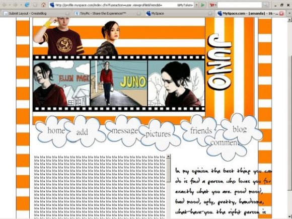
this layout of Juno is the better then other Juno layouts. KUDOS

looks nice but you got some rough edges that takes alot away from the layout. Overall it looks nice though

i like what the quote says. >_< lol. but yeah, its randomly there. good job overall. :)

i agree the quote seems so out of place with the rest of the layout. it's all clean cut and then you have a quote floating. but it looks really good! good job!


rollovers pleasee.
the wuote on the right looks very out of place.
the picture of juno at the top is poor quality and could be a smoother crop.


Great movie, good layout.
I think the nav could have fit inside the clouds better, but I think that's just me being picky.
Great job.

love it. using.
personally i like how the quote isnt perfect

this layout is sweet. you should try centering the quote so it's in the white box.

solider is a retard and makes shitty layouts. This is good, just it covers the ad.

Dont like it at all. It only shows half of it and it has writing behind. You didnt cover up all the text.
hey, this was an amazing, but no offense, the layout isn't quite up to par.
i like the effort, but it's definitely lacking in flair.
but hey, it's still awesome, and i like the quote.
good job.

The quote should be in the white space, but otherwise, this div is excellent.
Add Comment
You must be logged in to comment
Layout Details
| Designer |
curse-or-cure
|
| Submitted on | Feb 2, 2008 |
| Page views | 17177 |
| Favorites | 147 |
| Comments | 34 |
| Reviewer |
S-Majere
|
| Approved on | Feb 2, 2008 |