Grey, Black and White. (New Navigation.) (comments)
Displaying 21 - 33 of 33 comments


i really like this layout .. but yeah just kinna switch up the navi a lil bit :) but its still very beautiful


this one is similar to iviike's div layouts...the structure. your brushwork is amazing. nice job. you made this layout really nice even though it's in black & white. i would've made the content area bigger or at least the navigation smaller. this doesn't hide the ad right?

The navigation doesn't bother me.. I kinda like it. I love the entire layout too.


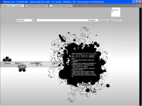
I like this layout, but the navigation is very annoying. It is frustrating how you can't click on PICTURES, everytime you try it just bounces back and forth, and the link says its going to blogs, instead of pictures. Its very annoying. You should fix that, I think it does that because it doesn't quite fit in the space. You should do custom roll over images for the navigation. If you don't know how to do rollovers, let me know in a message, and I'll explain in a very simple way, so you can do it. I'll even provide a working example.

Very unusual, just the nav that doesn't quite fit! Great work.

I love this, but I'm not sure I like the nav. I like the way it looks reg, but not when hovering. Great job over all though.

this is really nice. i think the links could be smaller when you hover over them


This is awesome, and the brushwork is amazing, but i don't like how the links just POP.
Add Comment
You must be logged in to comment
Layout Details
| Designer |
PaintMyFace
|
| Submitted on | Jan 31, 2008 |
| Page views | 60985 |
| Favorites | 481 |
| Comments | 33 |
| Reviewer |
Insurmountable
|
| Approved on | Feb 1, 2008 |