Avenged Sevenfold! (comments)
Displaying 1 - 16 of 16 comments


Hmm well it works fine for me. But anyway if its not working just replace the links that correspond with the words like add etc with your own so like go to your page and copy the shortcut to add yourself and paste it in that should work! hope that helps
Love the layout...I sampled it and i found that you cant click on the "pictures" or "add" link, theres like something blocking it i guess, how would i fix that?

not a fan of them.. but the layout seems a bit odd for a heavy band like them... had the blue been black and the music notes been something on the dark side like bats... it would seem more like them.
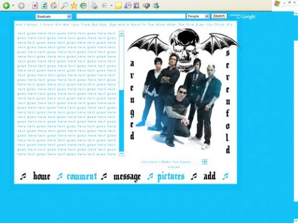
choice of font was pretty good and the bat behind them if you edited it, it came out pretty good
Nice navigation and font chosen for "Avenged Sevenfold." :]
Very good layout, you have here.
The only thing is, the wing of the skull bat is a bit bigger than the white background.
In all, it's good though. :)
Thanks for the comments.
it prob looks like an amateurs work coz i am a bit of one lol im learning though =].
And the skull is on their new album cover so thats why i put it on =]
Thanks

Very very nice. I like everything about the layout. The image, the navigation & the contact table in particular. Good work.

a bit too blue and black? makes the layout seem a bit of an amateur's work. i like what you did with the image. the skull...not sure about. choose different fonts. basically the details don't really go together. alone they're nice.

Yeah, i love the layout but the music notes I feel are my dislike. I think using A7X's logo would be pretty cool though =)
Anyways, still overall great layout, I may use it when Im done with my current layout. Thanks for sharing!

Add Comment
You must be logged in to comment
Layout Details
| Designer |
SoLongGoodbye
|
| Submitted on | Jan 30, 2008 |
| Page views | 18489 |
| Favorites | 75 |
| Comments | 16 |
| Reviewer |
brooklyneast05
|
| Approved on | Jan 30, 2008 |