Teal (comments)
Displaying 1 - 17 of 17 comments

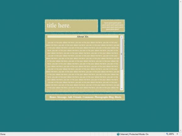
err. on my computer, everythingg is off. like, the header is not inside the tan box thingy.


font color: white;
You have that, it should have a hyphen between font and color.
:]
I like this though, I'm in love with the colour teal :]

there is no way to change the colours as the image has fixed colours, you can change the background colour but it will not match the background colour on the image.
and for the question about the photo link, copying and pasting your FRIENDID should work, you do not need your album ID, well, i didnt when testing.

hey
is there any possible way that you can change the colors of this??
hey can u help me out? the only link that won't work for me is the "photographs" one. even though my friendID is in place it still won't work. whats an album ID? do i need to put something there? b/c right now it says 0
in response to joedrummer55, however this applies to everyone.
replace YOURFRIENDIDHERE which is located in the links section in the id like to meet coding, with your friend id.
your friend id is located at the end of your myspace URL, view your own profile and there should be a short collection of five or six numbers. :)
x
i like this profile alot but im having a problem with the clickable things at the bottom like pics and freinds and all that stuff......
its saying that it has an invalid friend id or the acount has been deleted
idk wats going on, how do i fix this??
nice basic layout, however the title doesn't line up on my computer. not sure if it's only me seeing this...

This is very very nice. I like the colors and the link hovers.
i guess not everyones going to like it, all down to personal preference really >.<
had trouble getting it to fit in FF, as i dont use this on either computer. if youre experienced with HTML, you can move the 'title here' layer over by finding the area titled [b].title[/b] in the coding in the about me section, and change left to a higher number, somewhere between 295 and 395 (px) should do it.
(y) thanks for the comments.
as for the comment box, personally i dislike them. however you can always put a comment box in that area if you wish to, simply get one off of a website and ensure the width and length are set to 118px (width) and 50 px (height)
:D sorted.

not sure about the color combination. teal & light brown? the border...im not sure about. simple & clean solid would be nice. it's neat. make the font black or make the background color darker so that the words are more legible.
i like the colour but a little too simple for me.
i'm not so sure about the border either.
The "title here" is misaligned in FF; it's too far off to the left. Nice colors, though.

i think itd be cool if the "quote box" wre a comment box instead. :D justa thought. ^__^ you dont have take it seriously.

you forgot to put a dot(.) after the word photograph
very cute
this goes on my fav.
Add Comment
You must be logged in to comment
Layout Details
| Designer |
vintage-toile
|
| Submitted on | Jan 30, 2008 |
| Page views | 21236 |
| Favorites | 113 |
| Comments | 17 |
| Reviewer |
S-Majere
|
| Approved on | Jan 30, 2008 |