Pup! (comments)
Displaying 1 - 17 of 17 comments


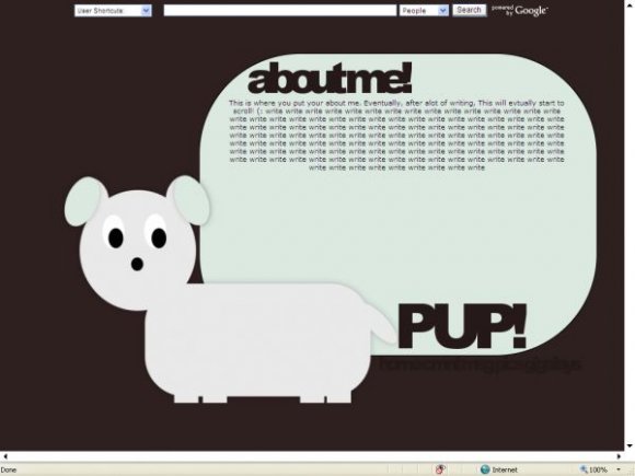
the pup's body looks awkward. the nav is too dark BUT this layout is still very cute. i also think a more interesting font would enhance the look.

Oh and may I add that I have a brigther computer with 32 bit colors (laptop) so I aplogize about the colors.
Thanks you guys. Oh and I didnt make this with photoshop or paint shop pro thats why I used basic shapes.


I like the idea, but you REALLY should have tried to draw the dog with vector lines instead of just using basic shapes. He doesn't have much of a form. =/

This is very nice, but it is sooooo hard to see the navigation.

the puppy has really short rectangular legs....still it's cute. i like the colors you chose (except for the background). make the navigation more visible. or at least have rollovers for them. the content area could be more interesting. i don't like the font for aboutme! or pup!
Its not very visible on the screenshot but if you look at the live preview you'll see it.
Add Comment
You must be logged in to comment