Using This Layout
For specific instructions read designer's comments
- This is a div overlay layout, html knowledge required!
- 1. Log into myspace.com
- 2. Click on Edit Profile (Profile 1.0)
- 3. Copy (ctrl c) and paste (ctrl v) code to the specified fields
Layout Comments
Showing latest 10 of 10 comments

i love layouts like this, good job!

i love different. cool!

hi felipot
This is great; I love the clean-ness of it,
but I think more could have been done with the navigation - a separate colour perhaps? Or a small image behind it?
:]

I like this soo much.

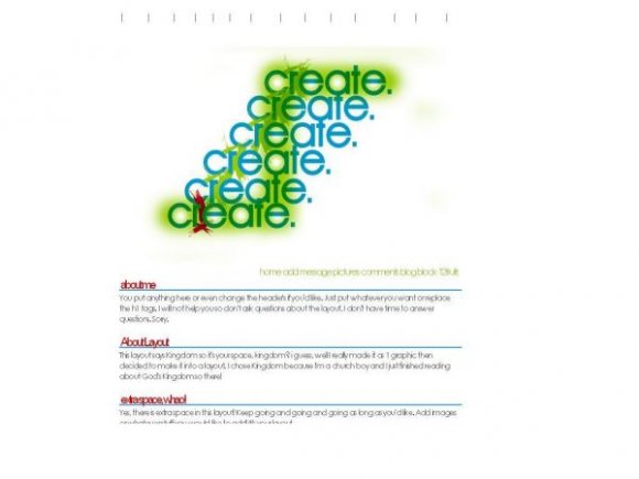
interesting. make sure to crop the top part of the banner because i can see the edge. im not sure about the color scheme. blue and green alone would've been nicer. have 2 columns instead of one, so the layout would look more structured and less plain since it seems very spatial. and im not sure about the banner itself. i gotta say, i like the simplicity of it.
Cool but I think you should have used a different font.
However, that's easily changeable.
Hm, simple and interesting banner. I don't like how the main text is minus-some pixels; it makes everything too hard to read. It's fine for the header titles, but otherwise no. :/ Overall it's a decent layout.

i dont think it should be a myspace layout.

I love this. So simple. I like having as much space as possible.