What happend (comments)
Displaying 1 - 20 of 21 comments


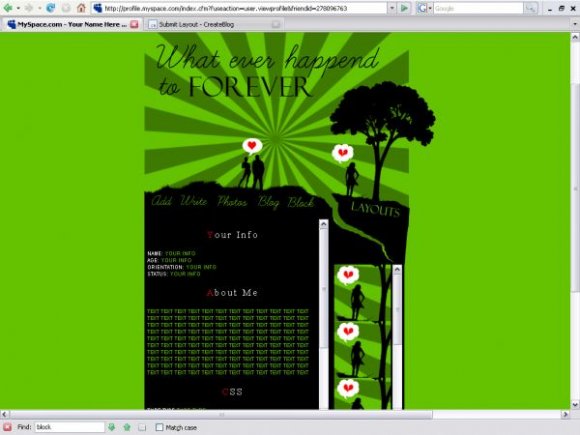
if you added just a few small, colorful, splatter brushes here and there, it would look better. otherwise, it's really a nice layout. i especially love the huge crack in the ground; it emphasizes the theme of heartbreak. ugh it's just brilliant lmao.


I don't really like red & green,
but i love this layout, nice work. =)

i actually like this; the color, structure, and theme of it. I like the navigation font as well, its not to extreme. for an experiment, you did a good job. minor things can be improve. your on your way to professional. :)

this is similar to miyashu's. like how the first letter is different color. im not sure i like green cause green & red is a bit too christmasy to me. y is there a horizontal scroll? i don like the font for navigation. or at least bold it and with rollovers if you can. i love the image. not sure about the stripes thing. very nice structure.

love the feel. very cute; nice shade of green too :)


on the tags too, and you spelled experiment wrong. great organization though.
Add Comment
You must be logged in to comment
Layout Details
| Designer |
none345678
|
| Submitted on | Jan 28, 2008 |
| Page views | 31643 |
| Favorites | 215 |
| Comments | 21 |
| Reviewer |
Relentless
|
| Approved on | Jan 28, 2008 |