Designer's Comments
Look carefully for specific instructions
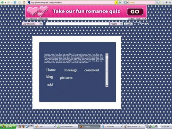
Using This Layout
For specific instructions read designer's comments
- This is a div overlay layout, html knowledge required!
- 1. Log into myspace.com
- 2. Click on Edit Profile (Profile 1.0)
- 3. Copy (ctrl c) and paste (ctrl v) code to the specified fields
Layout Comments
Showing latest 6 of 6 comments

are not*
The navigation links are placed nicely, and rollover effects would be nice. Also, the border is too thick.

rmeinds me a bit of american eagle outfitters :\

the links don't work. have them as png because it's bad quality. have the polka dots be bigger and more distant from each other. the border seems a bit too thick. even if it is minimal, have some variety of colors. i understand that this is your first div.

The nav links arent working for me??? and I agree with S-Majere, they are everywhere. Nav would look nice with rollovers. The font of the contect should be a little larger since the focus if being drawn to the background.

Hmm, the nav links are everywhere and the polka dots are a bit...blinding.
Layout Details
| Designer |
Thrasher
|
| Submitted on | Jan 27, 2008 |
| Page views | 14,839 |
| Favorites | 84 |
| Comments | 6 |
| Reviewer |
sweetasphyxia
|
| Approved on | Jan 28, 2008 |